Splash simplification and favicon polish
Full-viewport storefront splash refactor, mobile header cleanup, and a generated squircle favicon.
July 6, 2026
This update covers the current storefront presentation pass: the smoky location splash now fills the full viewport behind the header, the maintenance and signed-in storefront states share one reusable splash component, the mobile header is calmer on the first screen, and the web app now has a generated favicon based on the existing crown mark.
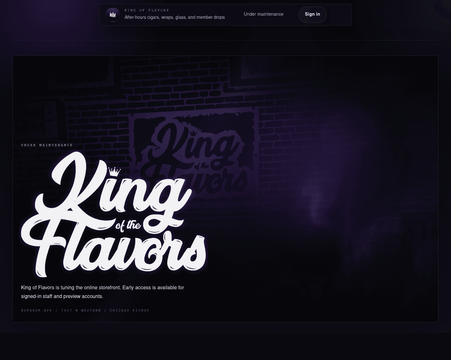
The point of the pass was simple: make the first impression easier to reason about. The old splash was strong visually, but it sat inside a framed section below the header. That made the page feel like a card inside a page instead of a single immersive location moment.
Maintenance splash
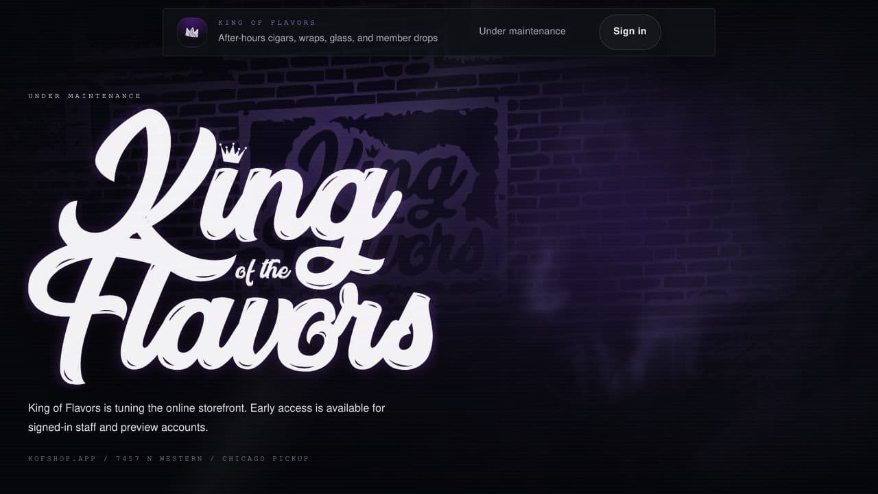
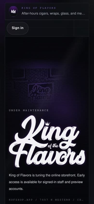
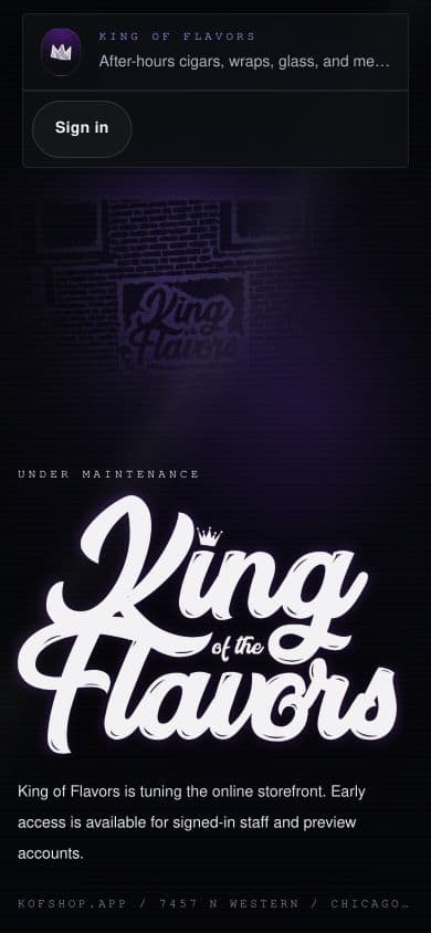
The maintenance page now treats the location artwork as the page, not a section within the page. The fixed header floats above the smoke and storefront image, while the logo, note, and location meta stay anchored inside the first viewport.
Desktop
| Before | After |
|---|---|
 |  |
Mobile
| Before | After |
|---|---|
 |  |
What changed
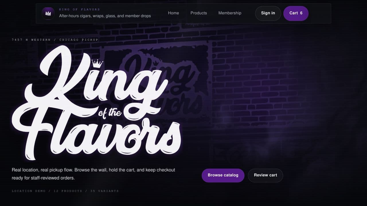
- The splash area now uses the full viewport width and height.
- The old bordered splash frame was removed from the first impression.
- The header sits above the splash instead of pushing it down.
- The maintenance copy now comes from the same shared splash component as the storefront.
Signed-in storefront splash
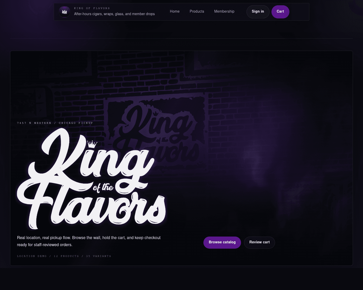
The signed-in home page got the same treatment. The hero no longer reads as a framed preview block; it reads as the first full-screen storefront state, with commerce actions layered into the smoky scene.
Desktop
| Before | After |
|---|---|
 |  |
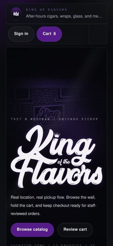
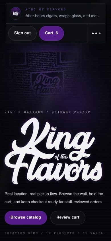
Mobile
| Before | After |
|---|---|
 |  |
What changed
- The home route no longer reserves top padding before the splash.
- The signed-in mobile header no longer wraps into three action rows on the first screen.
- The storefront actions remain visible, but the visual hierarchy now starts with the location and brand.
- The next content section begins after a true viewport-height first impression.
Shared splash component
The smoky splash was abstracted into a reusable LocationSplash component so the maintenance page and home page are not maintaining duplicate smoke shader, logo, copy, and meta markup.
That gives the app one place to tune:
- smoke shader preset usage
- logo layering and parallax behavior
- launch-state copy
- storefront action slots
- mobile and desktop viewport composition
This should make the next design pass safer. If the splash needs a tighter mobile crop, a different logo offset, or alternate animation behavior, the change can happen once instead of drifting across two similar implementations.
Favicon
The web app now links a generated SVG favicon at /favicon.svg. The generator uses the existing crown image as the source, scales it up for small browser-tab sizes, and places it inside a dark purple squircle that matches the header brand mark.

What changed
- Added a repeatable
bun run web:faviconscript. - Generated
apps/web/public/favicon.svgfrom the existing crown asset. - Linked the favicon in the Vite app HTML.
- Scaled the crown larger than the header mark so it remains legible at tab/icon sizes.
Current result
The splash now feels more like a deliberate storefront screen and less like a card inside a landing page. The favicon closes a small but visible browser polish gap, and the shared splash component gives future design updates a cleaner surface to iterate on.
The next UI pass can now focus on product density below the splash, mobile catalog flow, and whether the header should get a dedicated mobile layout instead of continuing to adapt the desktop chrome.