App review
Screenshot-based UI and UX review of the current storefront, cart, auth, member, and maintenance states.
App review
This review captures the current app as a set of real browser states from the Vite dev server.
Screenshots were taken with headless Chrome from http://127.0.0.1:5173.
Some screenshots use dev-only preview URLs so the docs can show states that normally require a signed-in session or cart activity. Those preview states are for review and documentation only.
Current direction
The app is converging around a strong dark retail shell: a persistent navigation bar, a cinematic location splash, product-heavy inventory pages, modal cart surfaces, and a quieter member access flow.
The most important current design decision is that the app is no longer only a storefront landing page. It is becoming a full operating surface:
- public maintenance / early access state
- product discovery
- product detail and add-to-cart
- cart review
- checkout steps
- sign-in and sign-up
- protected member locker
Maintenance splash

The maintenance splash now feels intentional instead of empty. It preserves the storefront hero proportions, keeps the shader work visible, and uses the same shared header geometry as the full app.
What is working:
- The centered nav position matches the main app.
- The right end cap stays visually present without exposing a menu.
- The sign-in path is clear for early access.
- The shader/sign composition gives the parked live domain a real brand moment.
What still needs judgment:
- The maintenance copy is appropriate for a vague live-domain state, but it should stay short.
- The large white logo is still the dominant read. That is useful for brand, but it can overpower the storefront/sign layer if pushed larger.
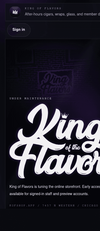
Mobile keeps the same idea, but the header is still carrying more text than the viewport comfortably supports.
Decision: either shorten the mobile subtitle or hide it below a breakpoint. The nav shell is good; the content density needs a mobile-specific rule.
Storefront preview
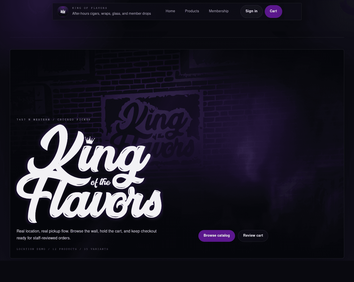
The storefront splash is the strongest unique visual system in the app. The SVG-driven smoke/storefront layer reads more custom than a normal ecommerce hero, and the bottom-left mark layout gives the page a distinct identity.
What is working:
- The shader feels tied to the store rather than generic smoke.
- The logo placement leaves a large visual field for the shader.
- Product actions are now present in the first viewport.
- The nav and splash feel like one system.
What needs a decision:
- The top of the page is still heavily experiential. That is good for launch polish, but repeat shoppers may want products sooner.
- The storefront effect should probably stay limited to the splash and loading moments so it does not compete with commerce surfaces.
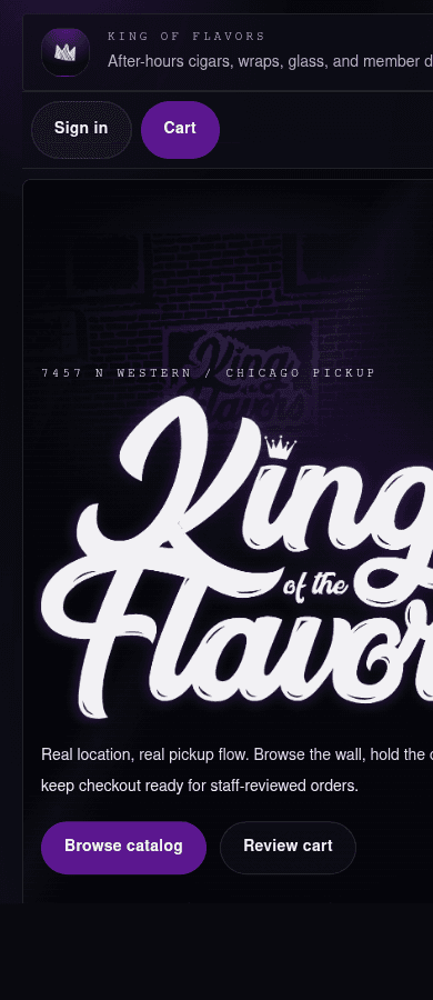
Mobile is close, but the header subtitle clipping is visible. The splash also becomes very logo-dominant at narrow width.
Recommended next pass:
- shorten or hide the header subtitle on mobile
- reduce mobile logo scale slightly inside the splash
- keep the primary actions visible without requiring a scroll
Catalog
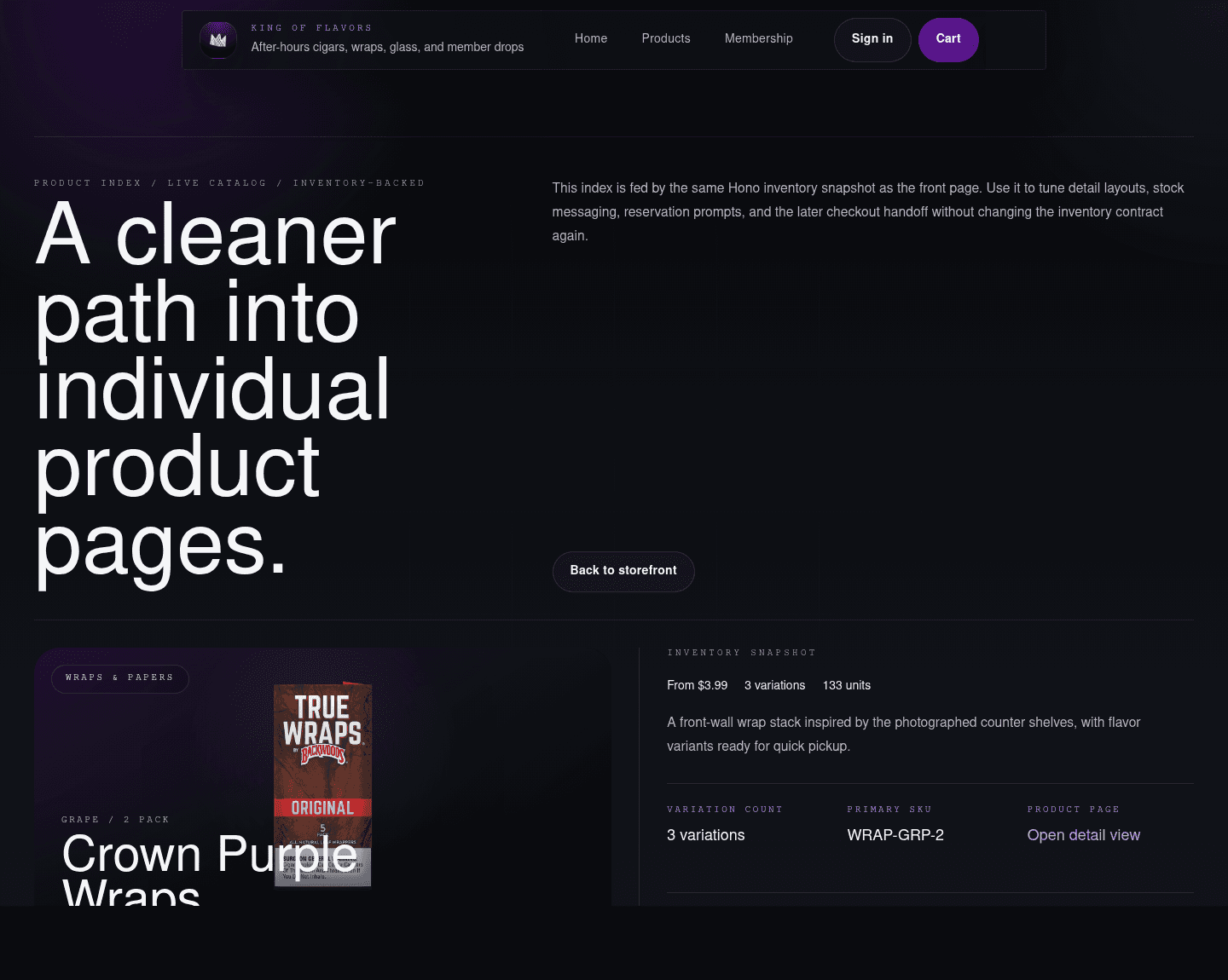
The product index is functional and credible. The page feels less theatrical than the splash and more like a catalog, which is the right shift.
What is working:
- Real product images make the demo inventory feel much more believable.
- Cards expose category, stock, variant count, and starting price.
- The catalog can support demo inventory now and live inventory later without changing the basic page mental model.
What needs a decision:
- The product grid could become denser as inventory grows.
- Search and category controls will become more important than large intro copy once the catalog has real volume.
Product detail
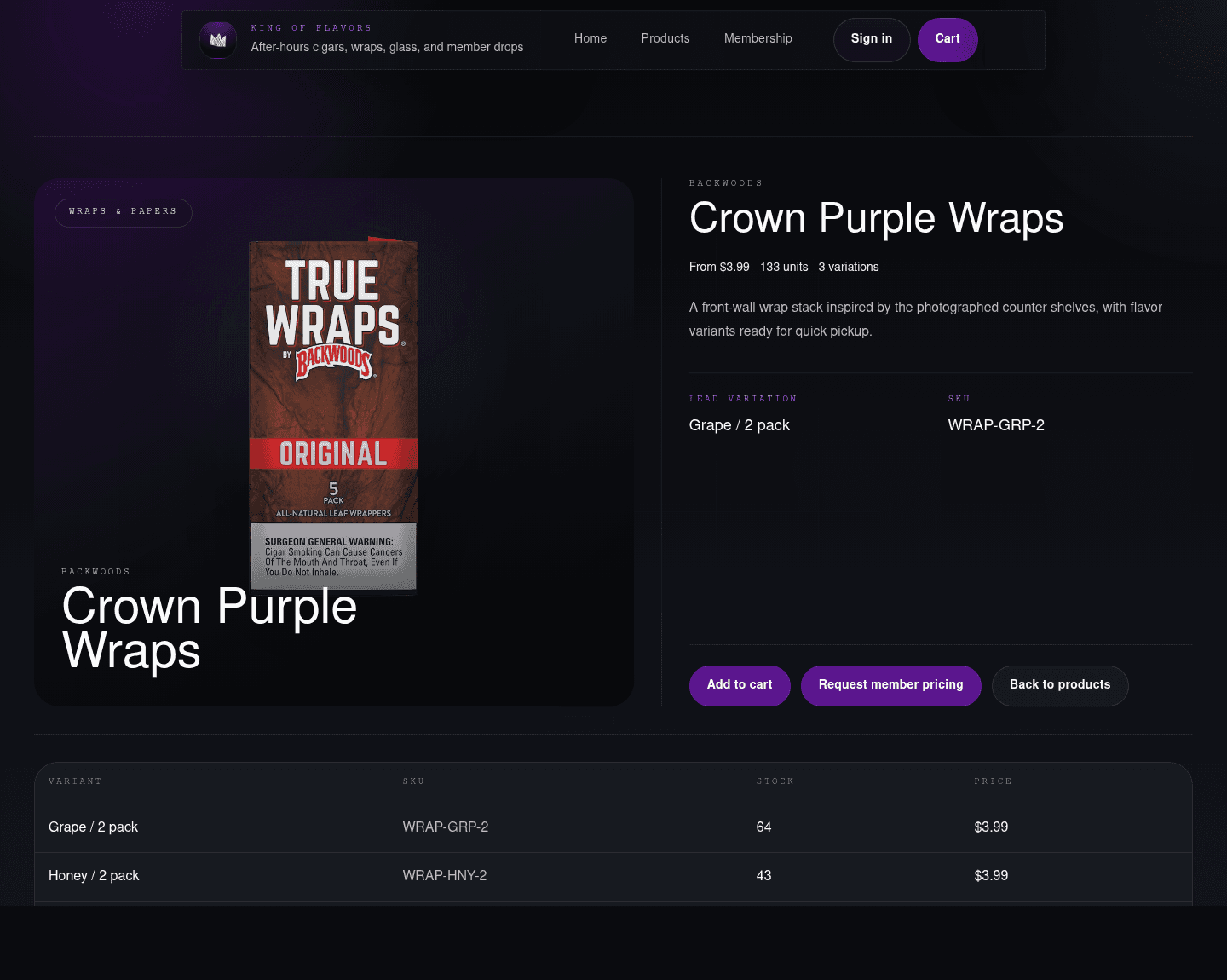
The product detail page is one of the more production-ready surfaces. It shows the SKU, variants, prices, stock, and cart path without hiding the operational details.
What is working:
- The product image and variant table feel like a real retail system.
- Variant-level stock is visible.
- The page supports staff-reviewed pickup rather than pretending every item is a normal low-risk ecommerce purchase.
What needs a decision:
- The first add-to-cart action could move higher for repeat shoppers.
- Member pricing and saved products need a clear role once member accounts mature.
Cart and checkout
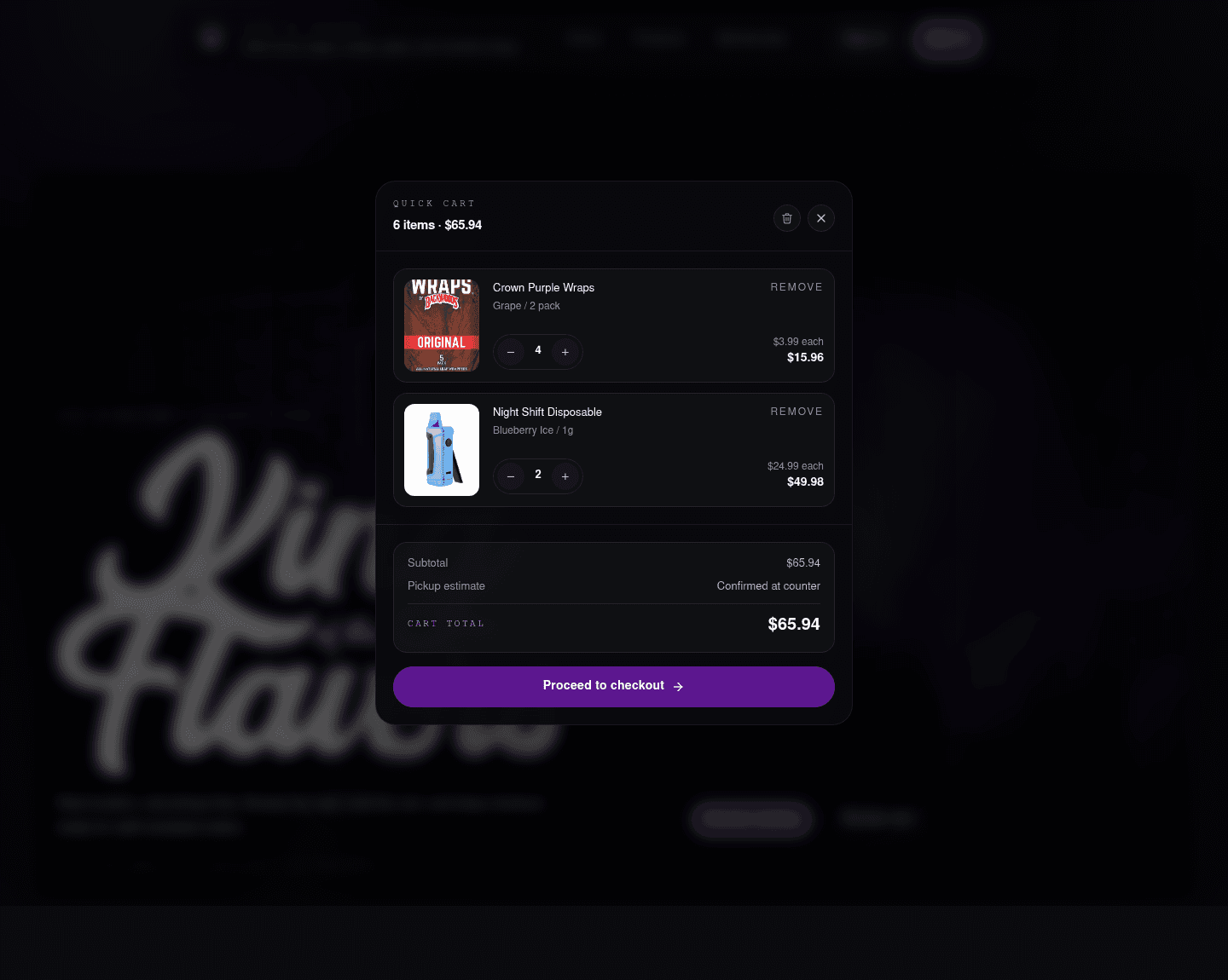
The cart now has the right feel: focused, modal, and operational. It is visually stronger than a side drawer for this app because it keeps the customer in the current context but makes order review the center of attention.
What is working:
- Line items are readable.
- Quantity controls are compact.
- The subtotal and pickup estimate are clear.
- The background blur keeps context without making the page busy.
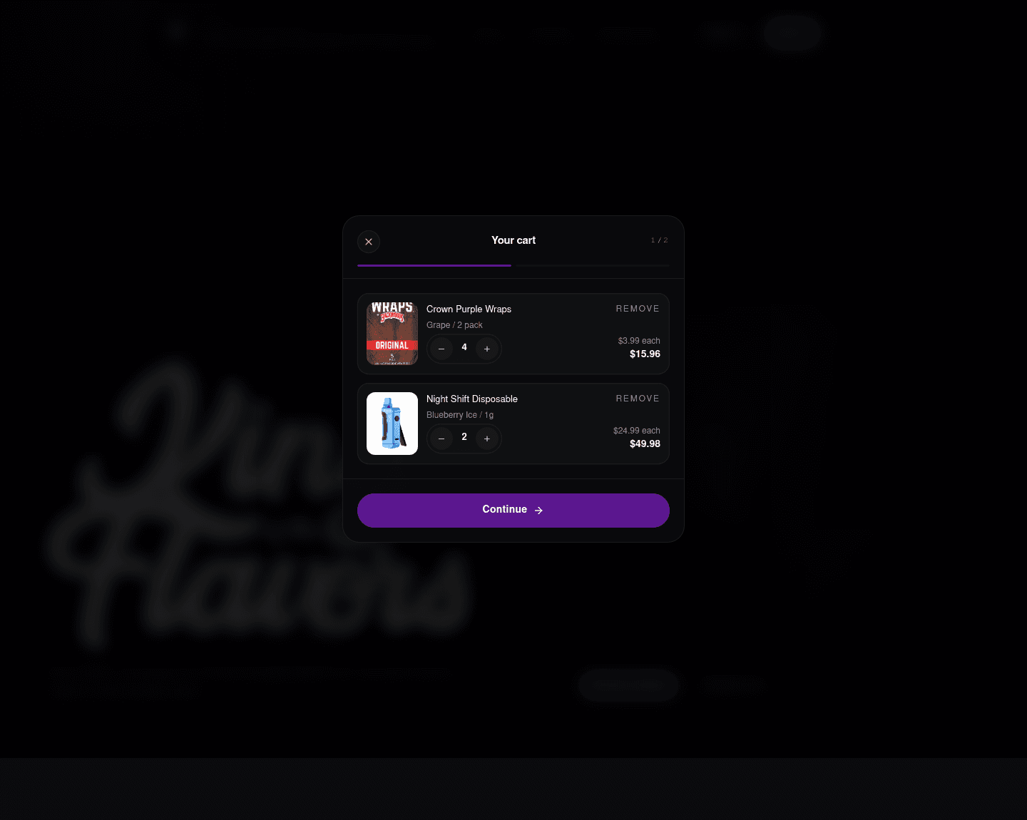
The checkout stepper is a good direction for pickup and NMI payment flows. It gives us a place to explain review, pickup, payment, and confirmation without turning checkout into a long static page.
What needs a decision:
- The first checkout step is calm, but later payment steps need the same level of polish.
- Pickup language should stay consistent: customer places the order online, staff reviews/fulfills, pickup is confirmed.
- The NMI payment component should remain visually contained inside this modal system.
Member access
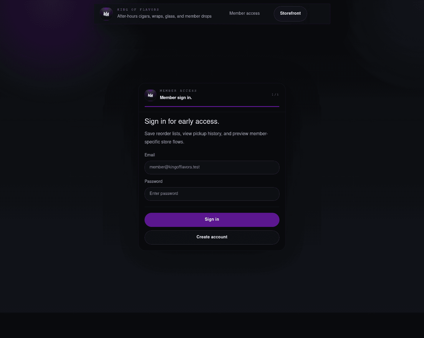
The sign-in flow now feels closer to the cart/checkout modal design, which is a good move. It is less like a standalone auth page and more like a controlled access point into the same app.
What is working:
- The form is centered and focused.
- The shared minimal header avoids cart leakage during auth.
- The blank right nav cap keeps the shell balanced without implying a menu.
What needs a decision:
- OAuth should remain hidden until the Supabase provider setup is stable.
- The form copy should be customer-facing, not implementation-facing.
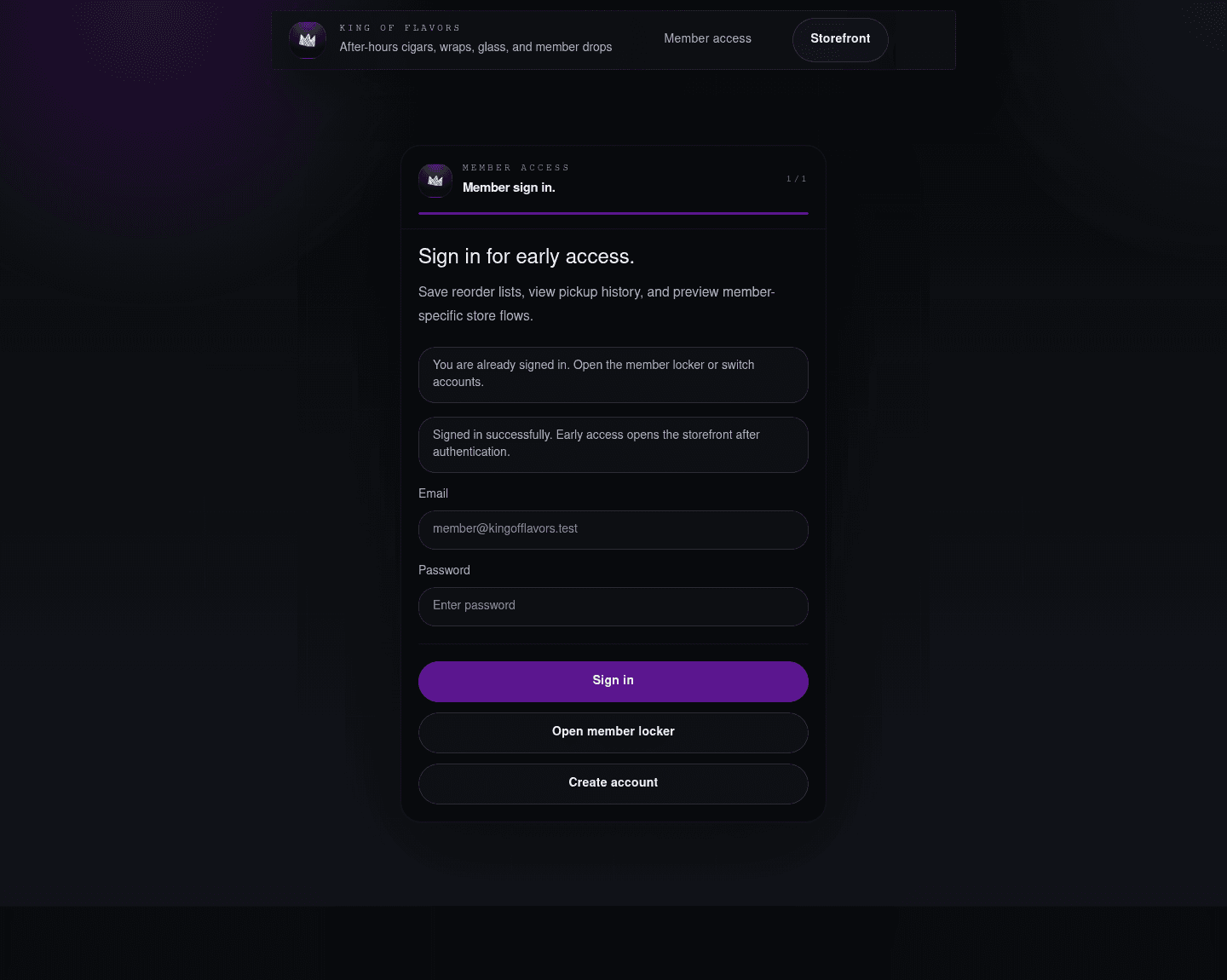
The mocked success state is useful for review. Production may redirect quickly, but it is still worth having a designed state for slow network, callback delay, or support screenshots.
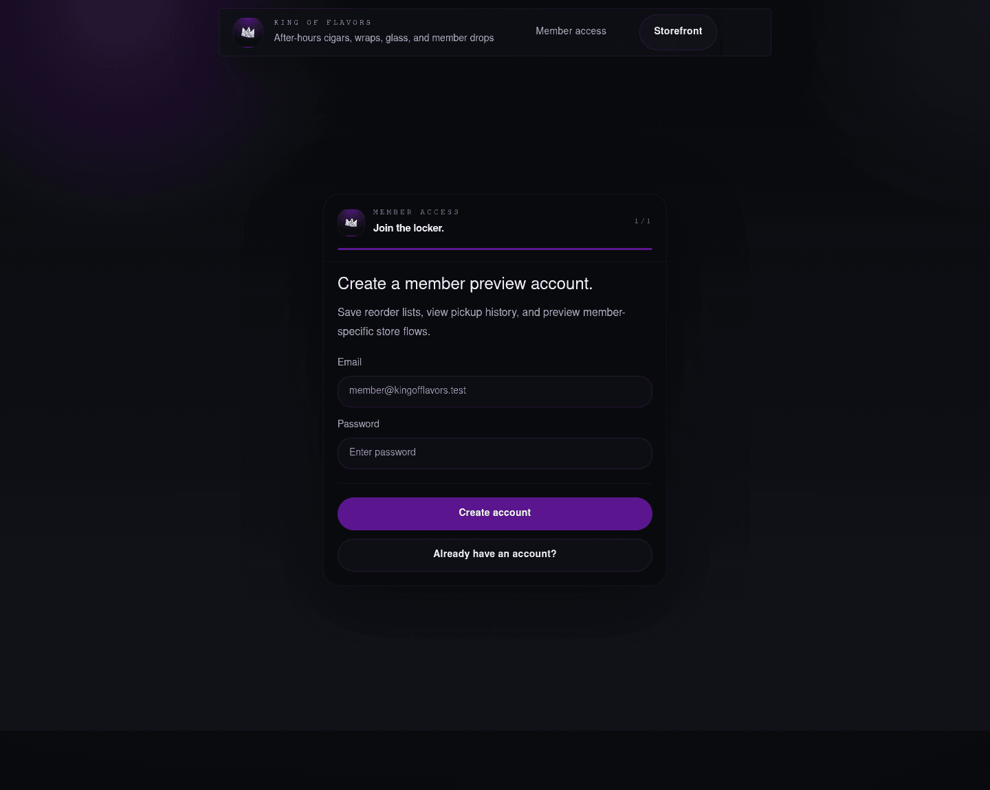
Sign-up mirrors sign-in well. The main UX question is whether public self-registration is appropriate for the first launch, or whether early access should be staff-created / invite-only.
Member locker
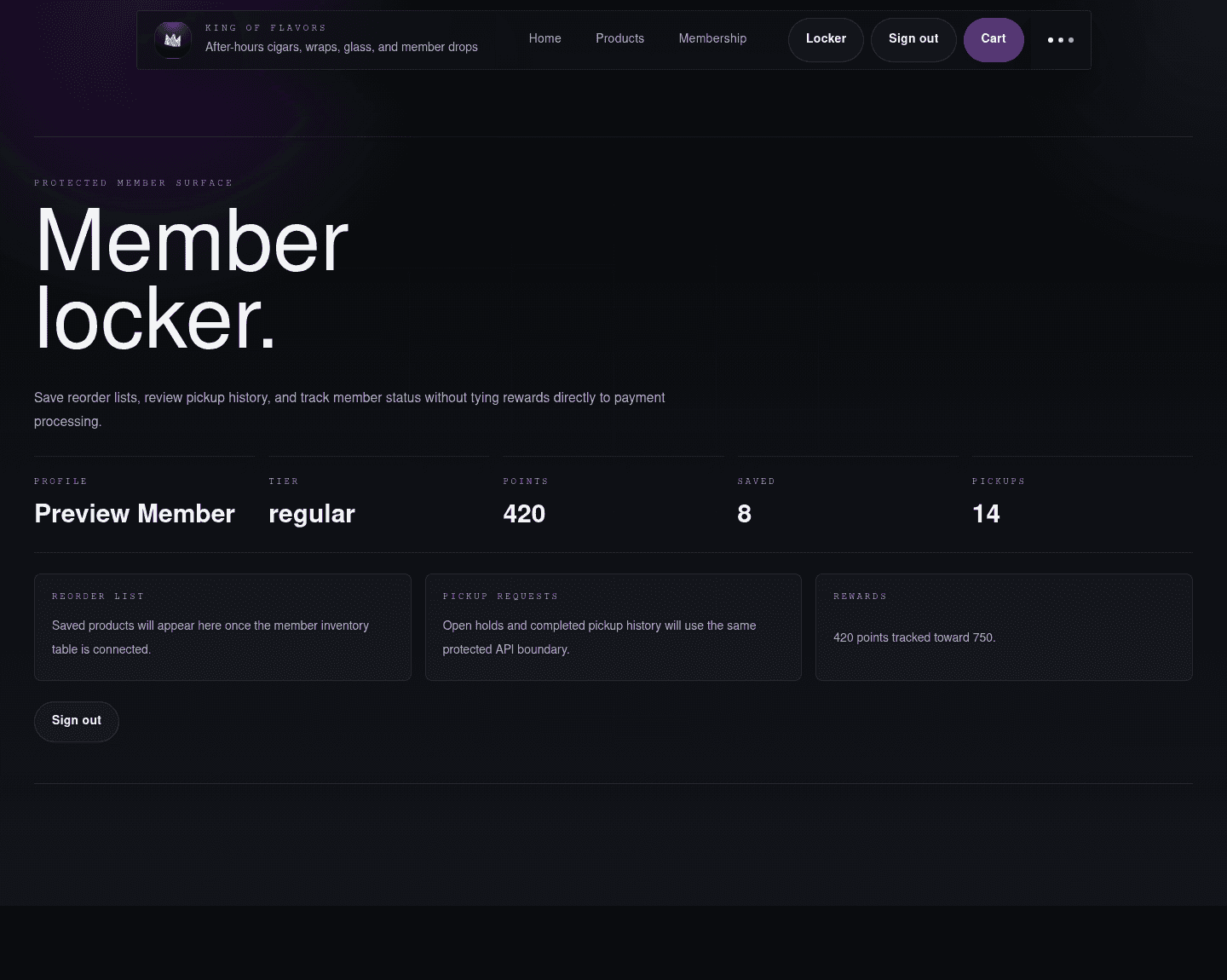
The member locker is intentionally more utility-focused than the storefront. That is right. It should feel like an account surface, not another landing page.
What is working:
- The nav switches into the signed-in state cleanly.
- Metrics give the page immediate structure.
- Rewards are framed as a ledger/status layer, not as a payment processor discount hack.
What needs a decision:
- The locker needs real saved products, pickup requests, and rewards data before it becomes client-demo complete.
- The huge page title may be too large for a repeated-use account dashboard.
Motion and shell
The app now has a persistent layout shell: the header stays mounted while route content transitions. The route content swaps through a short blur/fade/slide animation, and the header/content have view-transition names reserved for deeper browser-native animation work.
This should make page changes feel less like a reload. The next polish pass should test:
- home to catalog
- catalog to product detail
- product detail back to catalog
- storefront to sign-in
- sign-in back to storefront
- signed-in state to locker
The key design principle is that the shell should feel stable while the page content changes underneath it.
State URLs used for review
These are local development review URLs:
//?devPreview=storefront/products?devPreview=storefront/products/crown-purple-wraps?devPreview=storefront/?devPreview=cart/?devPreview=checkout/auth/login/auth/login?preview=success/auth/sign-up/locker?devPreview=member
The devPreview states are gated to development builds and are only for screenshot/review workflows.
Recommended next UI pass
- Tighten the mobile header subtitle behavior.
- Tune mobile splash logo scale.
- Continue cart and checkout polish through the NMI payment component state.
- Make the product catalog denser once more inventory is added.
- Add real member locker content primitives: saved products, pickup holds, reward status.
- Test the route transition feel interactively, especially back-and-forth between catalog and detail pages.