Mobile UI review
Screenshot-based review of the current mobile storefront, cart, checkout, and member surfaces.
Mobile UI review
This review focuses only on the current mobile experience. The captures use a 390px-wide phone viewport against the live local Portless app.
The useful takeaway: the visual direction is strong, but the mobile system is still acting like a compressed desktop layout in several places. The next pass should make mobile feel designed first, not merely responsive.
Public maintenance splash

What is working
The under-maintenance state has a clear mood. The real storefront sign, oversized wordmark, and restrained copy make the closed state feel intentional rather than empty.
The sign-in action is visible, and the screen still communicates that this is a real Chicago pickup storefront.
What needs attention
The header is too wide for the viewport. The subtitle truncates, the sign-in button drops into a second row, and the nav frame creates a lot of horizontal/vertical chrome before the actual splash content begins.
For the splash tweak, prioritize:
- one compact mobile header row
- shorter visible subtitle or hidden subtitle under 420px
- sign-in as a small icon/text action in the header
- less top padding before the hero image
- stronger crop control around the logo so the first screen feels composed
Storefront first view

What is working
The storefront preview immediately feels branded. The first screen has recognizable art direction, a visible cart count, and two useful actions: browse catalog and review cart.
The page is moving in the right direction for a smoke shop prototype: dark, image-led, and closer to retail than a generic landing page.
What needs attention
The first viewport is still mostly brand and atmosphere. The shopper sees no product card, no price, and no shelf detail without scrolling.
For mobile shopping, the first viewport should probably show one of these earlier:
- a featured product card
- a compact shelf summary with starting prices
- a sticky category/search row
- a product image peeking above the fold
Storefront shelf section

What is working
The shelf section finally introduces the stronger commerce idea: a wall-like catalog with visible product counts and filters. This is the screen concept to protect.
The “Shop the wall” heading is clear, and the shelf filter buttons are large enough to tap.
What needs attention
The sticky header overlaps the prior section while scrolling. The filter area is also very tall: “Find the next pickup from the counter wall” consumes most of the viewport before any product appears.
Next pass:
- reduce sticky header height on mobile
- avoid translucent header overlap on section boundaries
- make the shelf headline smaller and denser
- put filters and first product closer together
- make horizontal filters obviously scrollable if they overflow
Product index

What is working
The product index explains its purpose and shows a real product card beginning in the first screen. The tone is clean and consistent with the homepage.
What needs attention
The heading is too large for an operational catalog page. On mobile, “A cleaner path into individual product pages” reads as a marketing headline, not a browsing tool.
For a production catalog, tighten this page:
- smaller page title
- category/filter/search controls above the product grid
- first product card higher in the viewport
- compact inventory summary near the title
- less vertical spacing before the grid
Product detail

What is working
This is one of the better mobile surfaces. The product image is visible immediately, the product name is readable, and the detail page feels more like commerce than marketing.
The large product image also solves a real retail need: shoppers can inspect the item before adding it.
What needs attention
The page still delays purchase details. The first viewport shows the image and title, but the variants, price, stock, and add-to-cart action are below the fold.
Next pass:
- keep the product image, but shorten its vertical footprint
- surface starting price or selected variant before the fold
- bring the first add-to-cart action higher
- consider a sticky bottom purchase bar once a variant is selected
Cart drawer
What is working
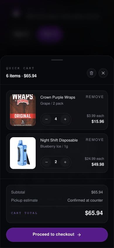
The cart drawer is the strongest mobile interaction in the current app. It feels purpose-built for a phone: bottom sheet, clear item rows, quantity controls, subtotal, and a strong checkout button.
The item rows are dense but still readable.
What needs attention
The drawer is good enough to become the mobile pattern reference. The next pass should align other mobile surfaces to this level of density and clarity.
Small improvements:
- make the drag handle and title area slightly more compact
- keep remove actions tappable but less visually dominant
- consider showing pickup/review messaging directly above the checkout CTA
Checkout drawer

What is working
The checkout stepper direction is promising. The page communicates sequence without becoming a long static form.
The bottom CTA is strong and reachable.
What needs attention
The top half of the screen is mostly dark overlay before the sheet begins. On mobile, that makes checkout feel lower and heavier than it needs to be.
Next pass:
- open checkout slightly higher or let the sheet claim more height
- add a concise explanation of the current step near the title
- keep cart item review compact
- reserve the strongest visual weight for the active CTA and step state
Member locker

What is working
The member locker is quieter than the storefront, which is appropriate. It reads as an account utility surface instead of another hero page.
The stats are simple and legible.
What needs attention
The header/controls are crowded. The locker, sign-out, cart, and overflow controls compete with the page title, and the large “Member locker” heading starts under the floating controls.
Next pass:
- simplify the authenticated mobile header
- move sign out lower or into overflow
- keep cart visible, but reduce competition with account controls
- tighten the first viewport so profile information starts cleanly
Priority fixes
- Redesign the mobile header as its own component/state, not just a wrapped desktop header.
- Bring product or shelf information higher on mobile storefront screens.
- Reduce hero-scale type inside utility/catalog pages.
- Use the cart drawer density as the reference for mobile commerce surfaces.
- Improve sticky header behavior so it does not visually collide with section content.
- For the splash tweak, make the first mobile screen feel composed: compact header, controlled logo crop, and less empty chrome.
Suggested next implementation order
- Mobile header and splash cleanup.
- Storefront first viewport and shelf section density.
- Product index mobile density.
- Product detail purchase-action placement.
- Checkout sheet height/content polish.
The app already has the right visual mood. The work now is to make mobile feel faster, calmer, and more obviously shoppable.